
You’ve most likely sat through countless meetings, whether regular monthly, quarterly or annual or perhaps ad hoc team meetings, reviewing business metrics, data and information. In most of the meetings I’ve attended, the important business information and data was captured in text alone, listing all the pertinent numbers, percentages and metrics. Does this look familiar?
Copyright © Upskill Consulting (2018). All rights reserved.
Transforming your data and information into a visual representation will not only create a more palatable medium for your audience but will also increase comprehension and overall retention of the information. It’s said that visual information gets to the brain at a rate of 60,000 times faster than text alone.
In all of my training delivery, I design training material that incorporates both data/information and images. I’ve found that learners not only comprehend the information more readily but retain it for longer periods of time. I use the concept of infographics not only in training but also in various communications including presentations, email blasts, strategic planning and team meetings to mention a few.
Let’s walk through the key principles of infographics and how you can begin to transform your business data into strong visual representations of information for your teams, senior leadership and/or executives and even clients.
What is an infographic?

During a corporate training session a few years ago, I learned about the ‘Picture Superiority Effect’. The basic premise is that in order for us to retain information for longer, we need to ensure that our communications incorporate both pictures and text.
- We only retain 10% of information 3 days later when we present it in text alone.
- We retain 65% of information 3 days later when we present it in both text and image.
Source: http://www.brainrules.net/vision
Let’s compare these two examples.
Example #1: Text Alone
|
High quality infographics are 30 times more likely to be read than text articles.
|
Example #2: Combination of Text and Image

Copyright © Upskill Consulting (2018). All rights reserved.
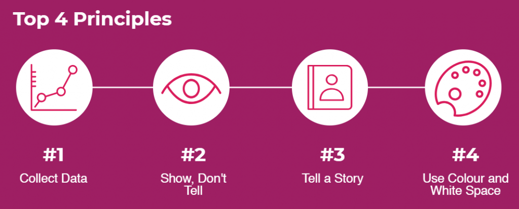
What are the top 4 key principles of building an infographic?
Copyright © Upskill Consulting (2018). All rights reserved.
#1 – Collect Data
Building a compelling and memorable infographic, starts with collecting not just any data … but the right data to showcase! Take the time to rummage through the metrics, numbers, information and make sense of it. Carefully pick and choose the information that would resonate with the audience and illustrate your core message.
#2 – Show, Don’t Tell
Capturing your information in a visual representation or format allows the audience to better understand and retain the information. It’s the art of using visuals to represent the numbers, statistics, processes outside of a typical text format.
Here’s an example illustrating the Twitter users/community. Rather than providing strictly numbers in bullet form, this infographic explains its core message using a combination of numbers and images.

https://informationisbeautiful.net/2009/if-twitter-was-100-people/
#3 – Tell a Story
To connect with your audience and ensure that your message or idea is sticky, it’s important to tell a story. Stories that tap into both the emotional and rational brain will ultimately have a stronger impact on the audience. To read more about the art of storytelling, refer to my last blog on the topic.
https://upskillconsulting.ca/2018/05/14/the-art-of-workplace-storytelling/
An infographic should also logistically make sense with a beginning, middle and end. I often storyboard my information prior to working on building the presentation or report.
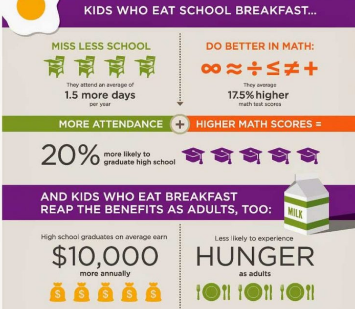
Here’s an example walking the reader through the story of the importance of eating breakfast before school. It starts with statistics captured in a visual representation about kids eating breakfast prior to the start of their schooldays, continues with the impacts on high school students and graduation and ends with the impacts into adulthood.
https://igniteaction.co/blog/2016/6/21/how-to-make-beautiful-and-effective-infographics
#4 – Use Colour and White Space
Colour and white space are incredibly important in graphic design. When building your presentations, it’s important to keep in mind that the colours you choose and how you choose to layout your design will either make or break your infographic. Some believe that white space is wasted space, whereas in graphic design and in adult-learning concepts, the opposite is true – less is more!
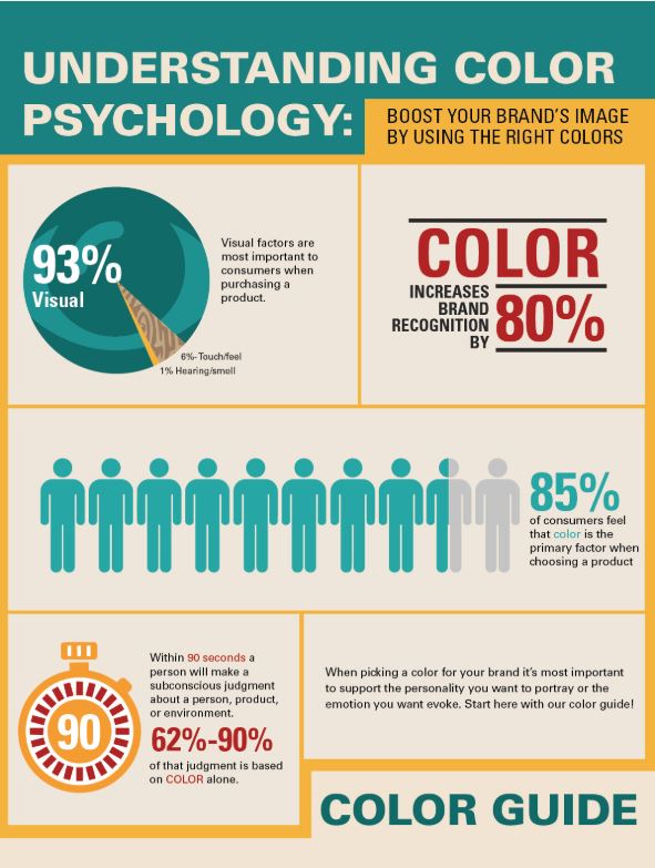
Here’s an example of an infographic that has used three simple colours to illustrate their infographic. The three colours are palatable and create a clean and aesthetically appealing visual for the reader.
http://blog.bagsandbowsonline.com/infographic-boost-brands-image-using-right-colors/
What are some resources I use to create infographics?
For colour choices, I use www.color.adobe.com to help me choose complimentary colours. It’s a fun tool to help you choose the right colour scheme for your next presentation.
For template choices, I use https://piktochart.com/. For all of the graphics in this blog, I have used Piktochart to capture my information into visual images/layouts.
These are two easy-to-use programs with free options to help you bring your next presentation to life.
Putting the 4 Principles into Practice
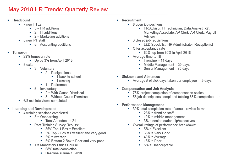
Remember this?
Copyright © Upskill Consulting (2018). All rights reserved.
So how can we apply the four key principles and make this a better visual representation for our audience?
- Collect Data
- Show, Don’t Tell
- Tell a Story
- Use Colour and White Space
To transform this PowerPoint slide, I would consider the following:
- Break up the data and metrics into more manageable chunks of information within a few slides
- Represent the #s visually rather than text solely
- Use icons to illustrate HR trends
- Provide comparatives to tell a story (current state vs. past state vs. anticipated future state projections)
- Utilize corporate colours to ensure aesthetically appealing slides
- Capture only important data on slides with the remaining information in talking notes
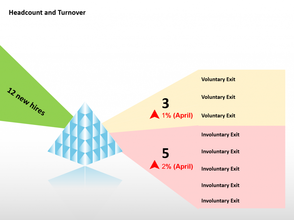
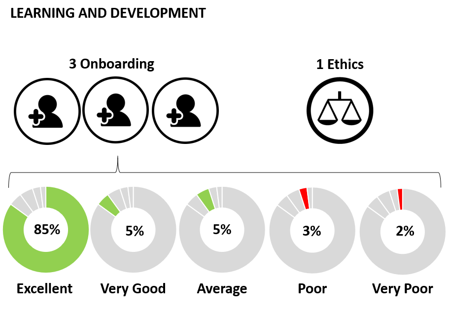
Here are some alternative ways of presenting the HR metrics for May:
 Copyright © Upskill Consulting (2018). All rights reserved.
Copyright © Upskill Consulting (2018). All rights reserved.
So for your next presentation, I challenge you to let the creative juices flow and transform your day-to-day business data into something more memorable and impactful through visual representation such as an infographic.

Throughout Sofia's career she has engaged in various functions of HR, always with a mindset of translating business strategy into systematic HR initiatives. Her HR experience has involved overseeing day-to-day operations, developing HR strategies, leading organizational changes and partnering with leadership to drive and deliver on HR principles and business strategies.
Her specialization in HR includes training and capability development, performance management, employee engagement, change management and organizational development.
Sofia has a Bachelor of Arts Degree in Psychology from Simon Fraser University,a Post-Baccalaureate Diploma in Human Resources Management from Kwantlen Polytechnic University and holds her Chartered Professional in Human Resources (CPHR) designation.
- Bridging the Leadership Gap: The Power of Facilitated Learning in Evolving Expertise - March 11, 2024
- Unlocking Potential: The 3-2-1 Approach to Transformative Leadership - January 17, 2024
- Elevate Your Business with Effective Performance Management - December 27, 2023